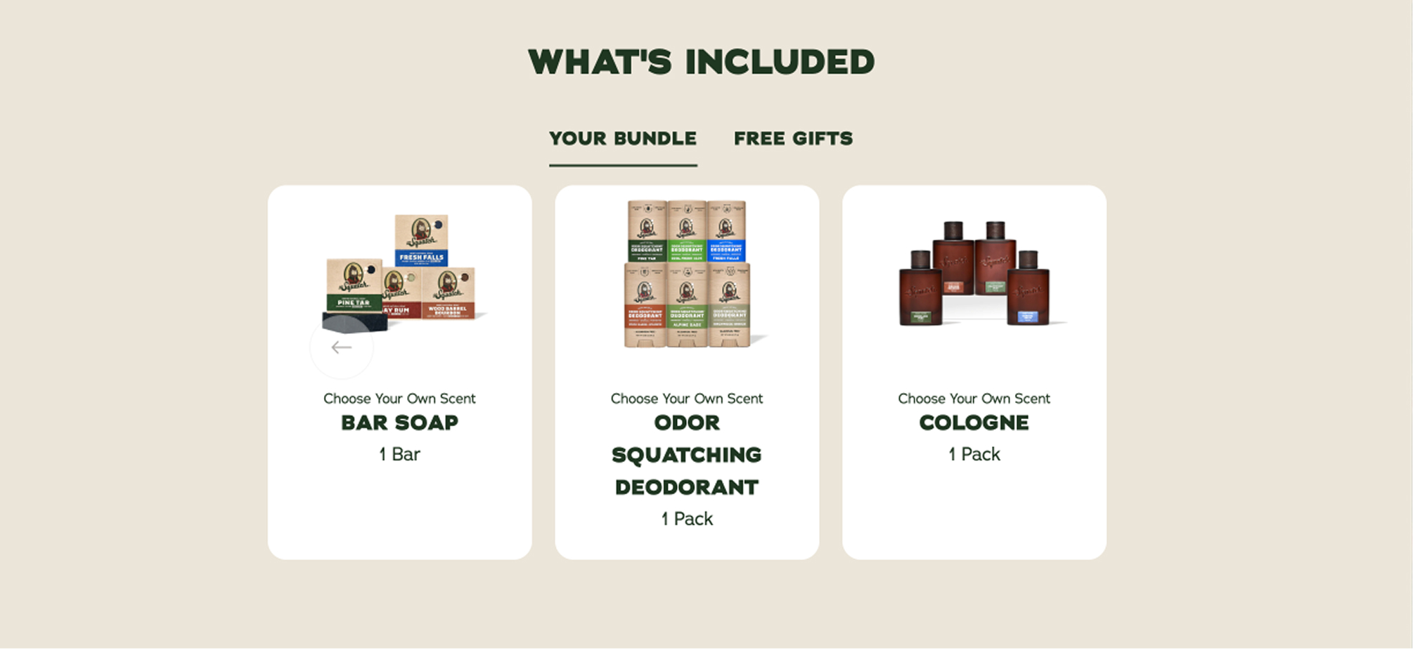
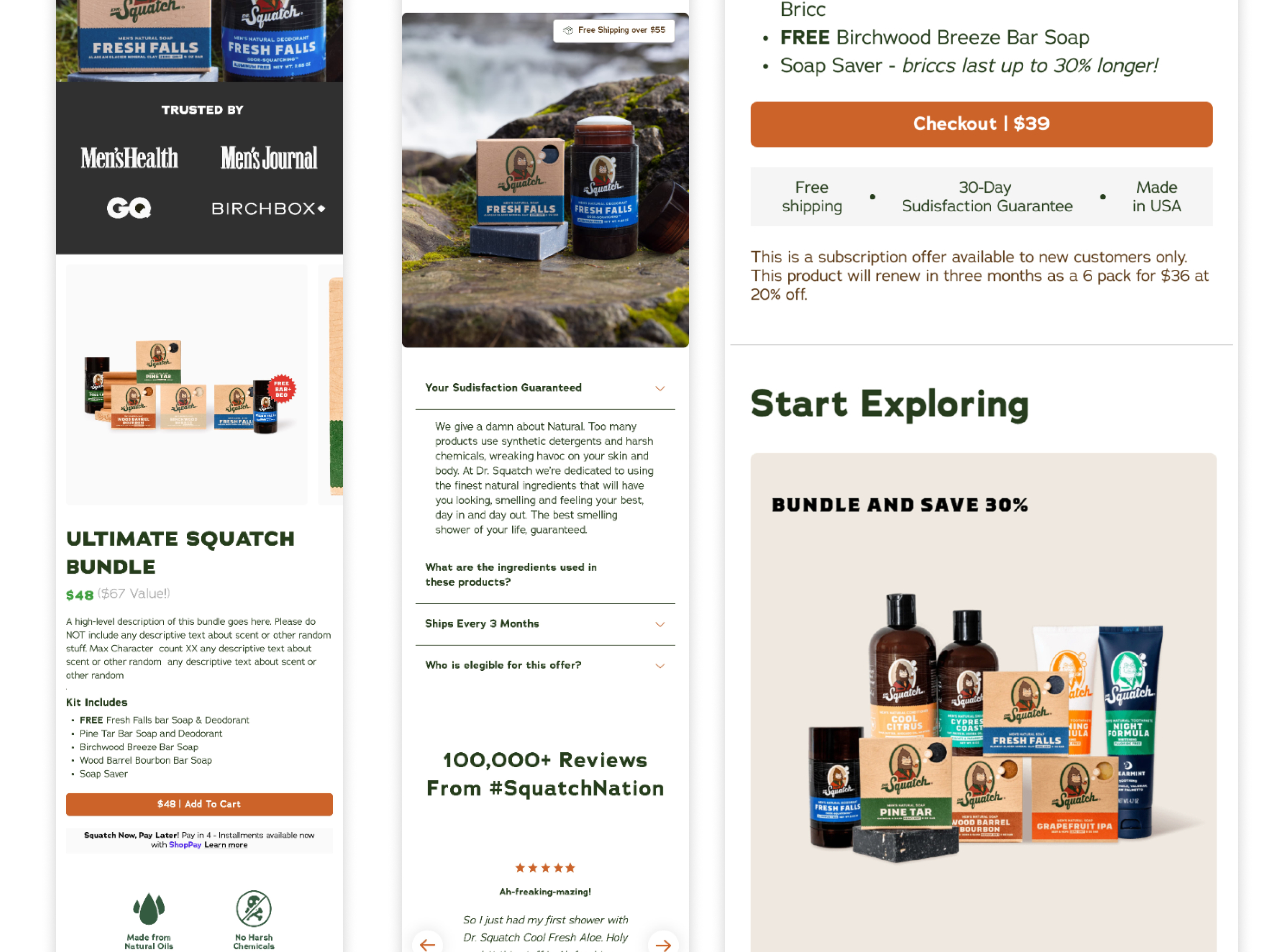
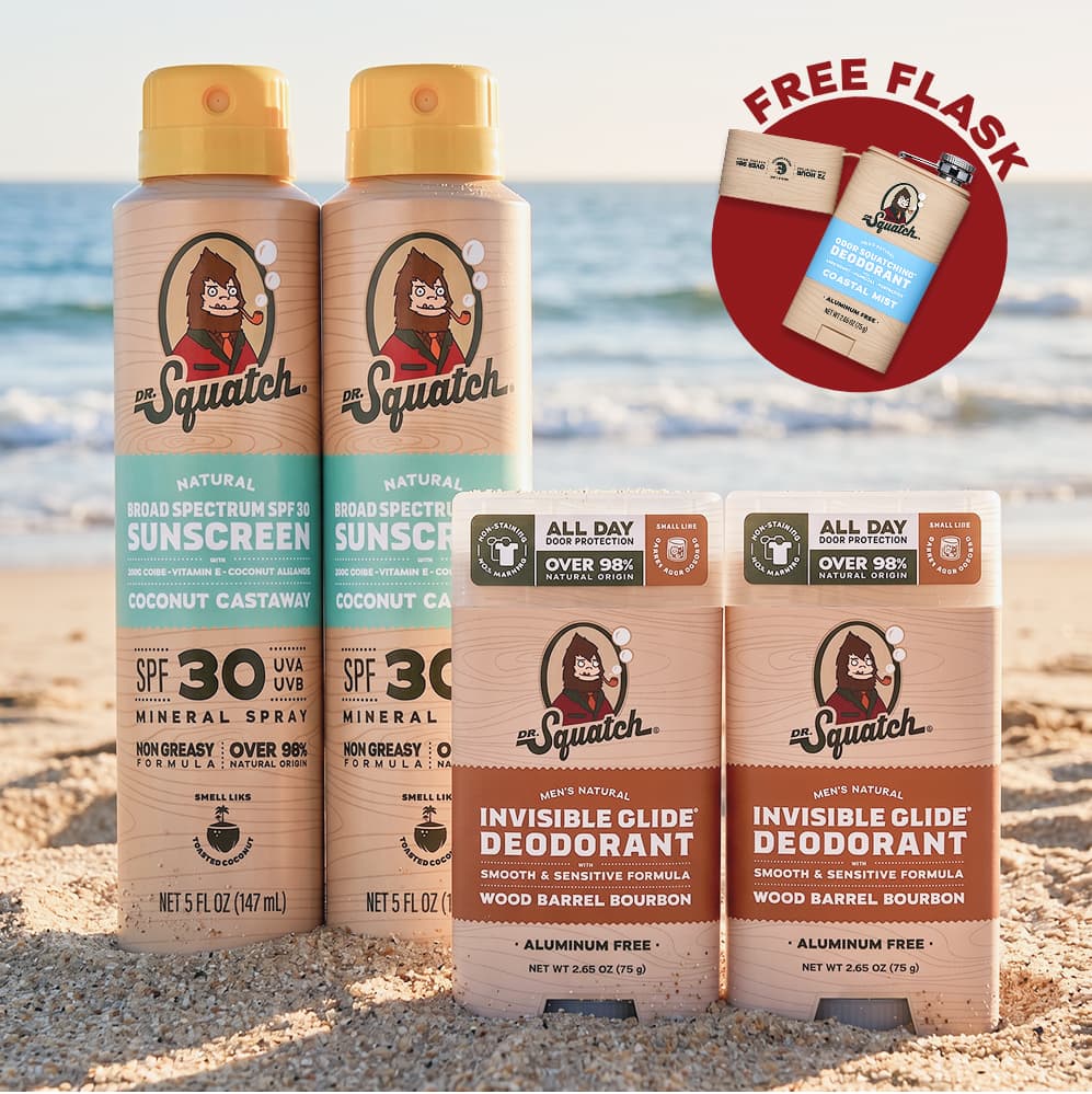
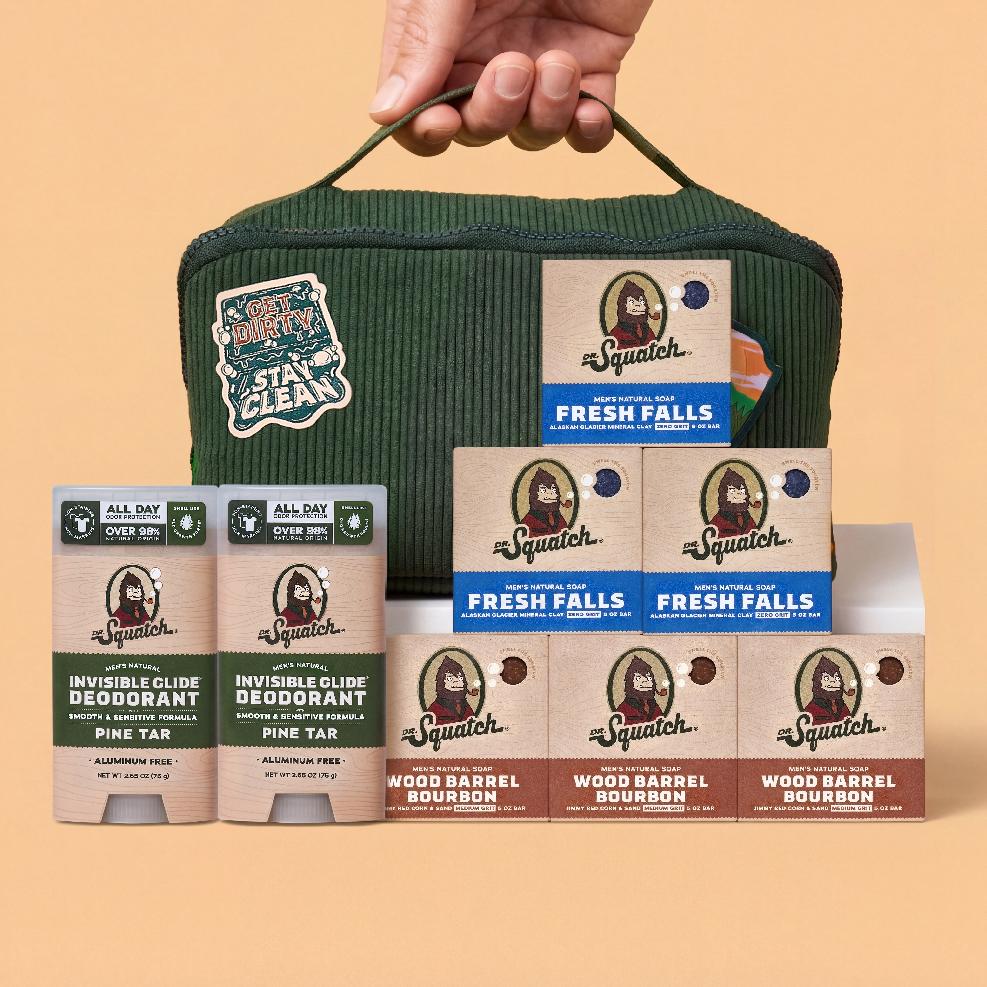
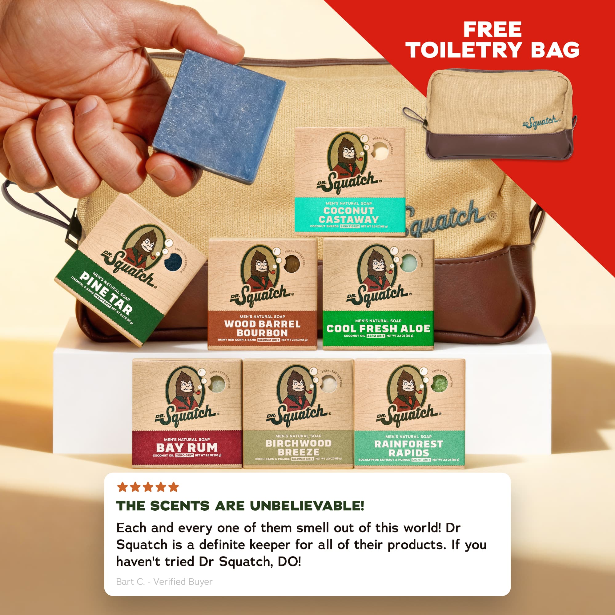
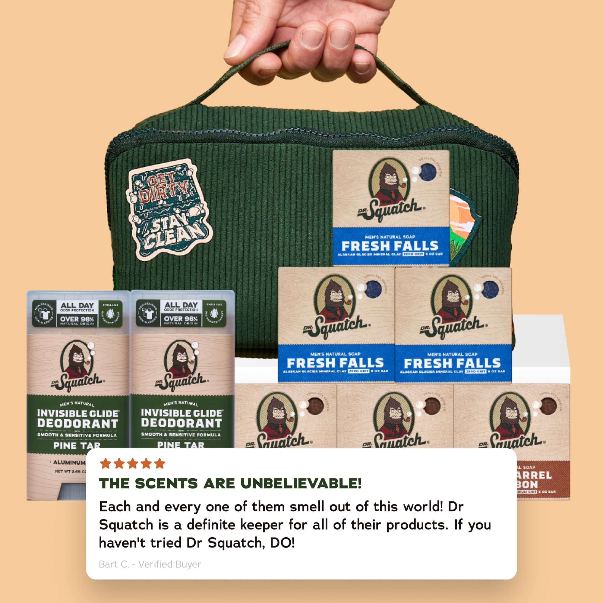
Dynamic Bundle Builder
I designed a new tiered bundle builder PDP for bar soap that brings custom bundling, tiered pricing, and subscription into one flexible shopping experience. Customers can build a pack from 3 to 12 bars, unlock better pricing as they add more, and choose between one-time purchase or Subscribe & Save.
Opportunity
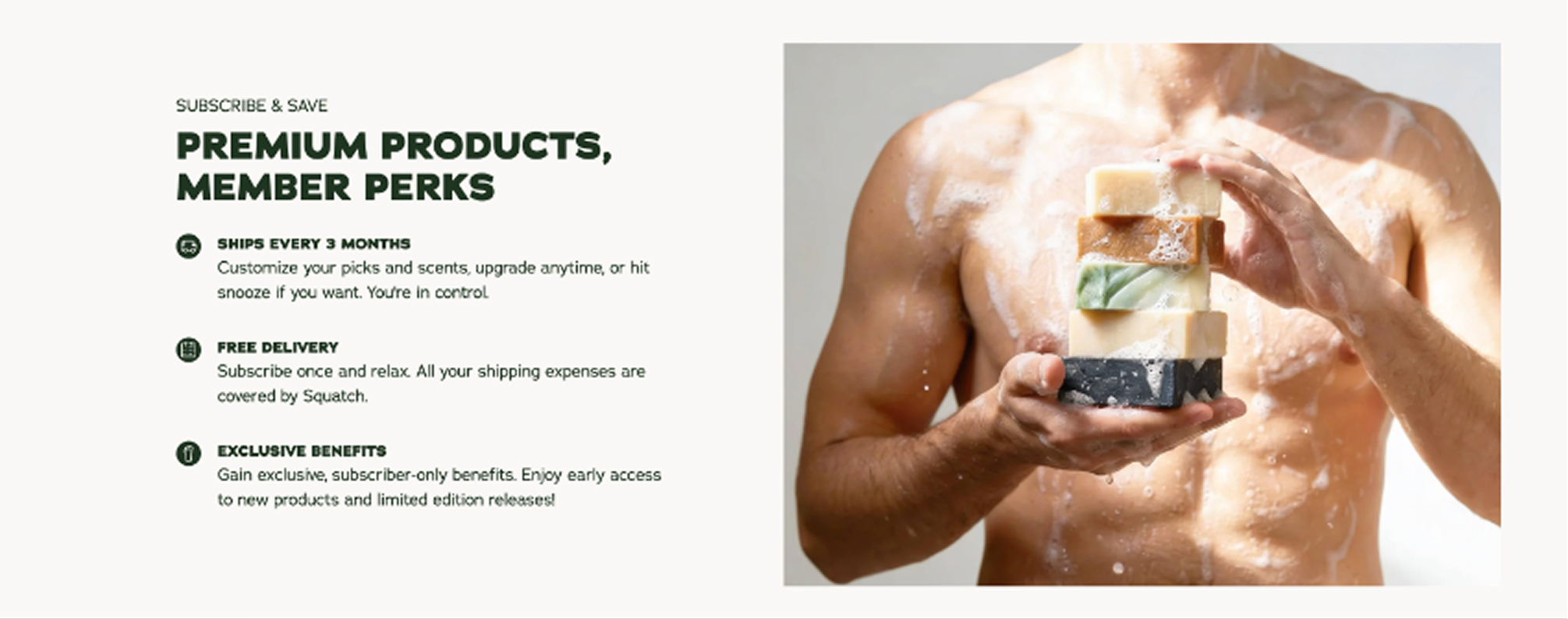
Subscription Growth
- Goal
- Make subscribing feel more flexible and accessible from the PDP.
- Design Execution
- Subscribe & Save purchase option with dynamic savings and configurable default selection.
Opportunity
Bundle Flexibility
- Goal
- Give customers more control over how many products they add.
- Design Execution
- Inline quantity steppers on product cards with clear minimum and maximum states.
Opportunity
Pricing Clarity
- Goal
- Help customers understand how quantity changes value.
- Design Execution
- Tier progress milestones with dynamic per-unit price, total price, and savings updates.
In planning, we translated the growth goals into product requirements: flexible bundle quantity, tiered pricing milestones, one-time and subscription options, dynamic price updates, and configurable default bundles for paid traffic.
Requirement
3-12 Bar Builder
Customers needed to build a bundle at their preferred quantity, with clear minimum and maximum states.
Requirement
Tiered Pricing
The builder needed to show how adding more bars changes per-unit price, total price, and savings.
Requirement
Purchase Options
Customers needed to switch between One-time and Subscribe & Save without leaving the builder.
Requirement
Mobile Review
On mobile, customers needed a persistent way to review their pack and add to cart while scrolling.
We mapped the core paths for building from scratch, landing on a pre-configured pack, switching between Subscribe and One-time, editing quantities, and handling rules like minimum quantity, max quantity, Limited Edition gating, and out-of-stock scents.
[ Show: PDP to ATC flow diagram plus edge case matrix ]
I then designed the prototype with product cards, inline quantity steppers, a tier progress bar, dynamic price and savings updates, purchase option cards, and a disabled CTA until the customer reached the 3-bar minimum.
[ Show: main builder UI, pricing milestones, sticky CTA, editable drawer, and final desktop/mobile screens ]
The prototype aligned design, engineering, and leadership around a scalable builder model that could start with bar soap and expand into other categories.
PDP
Modular product detail page that growth could re-arrange per category and per test.
[ PDP content placeholder ]
Cart Free Gift Widget
I redesigned the cart Free Gift widget so promotions could stay flexible without breaking the cart UI. The update helped the experience support more complex gift rules while giving internal teams clearer boundaries for future promo setup.
[ Show: promotion complexity diagram or recreated crowded cart state ]
I translated the business limits into UI rules: up to 3 cart tiers, up to 3 total free gifts, and up to 3 gifts within a single tier.
[ Show: simple rules card with max tiers and max gifts ]
The widget needed to support two paths: customers choosing their own gifts and the business automatically assigning gifts. I mapped both so each state could communicate clearly.
[ Show: customer-selected vs business-prescribed gift flow ]
I designed compact states for locked tiers, unlocked gifts, selected gifts, prescribed gifts, and max gift scenarios so the cart stayed easy to scan across mobile and desktop.
[ Show: locked, unlocked, selected, prescribed, max states, and final cart widget ]
The final design gave customers a clearer free gift experience while helping internal teams stay within UI-safe promotion limits.